Year
2021
Deliverables
Logo
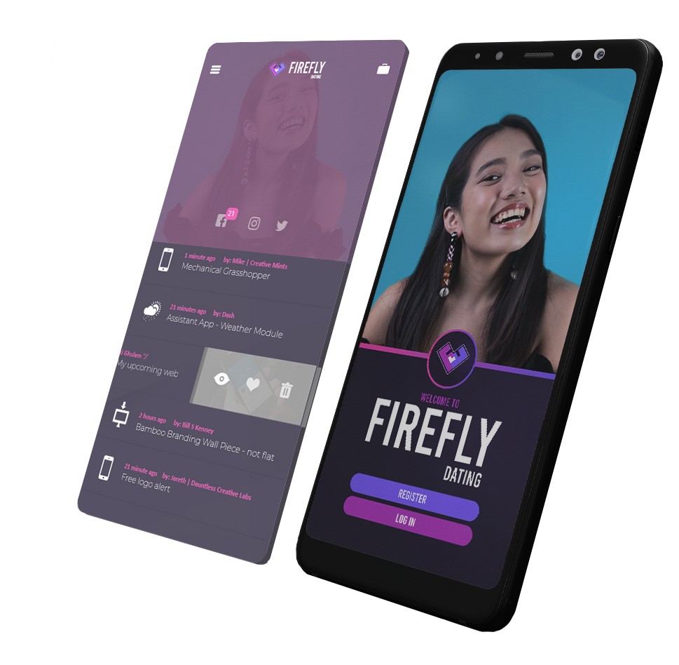
Firefly Dating
A unique way to authenticate your matches through the same swipe to match as before, except now, users are prompted to upload a 10-second selfie video. This helps ensure further user autheniticity by matching content that is more engaging and current. Meet your spark and fly away.
LOGO DIRECTION
The team behind Firefly is known for their love for games, such as Fortnite. Neon hues ranging from magenta to blue were prevalent in their envisioned visual style, further emphasizing the theme of gaming and futuristic motifs.
LOGO ELEMENTS

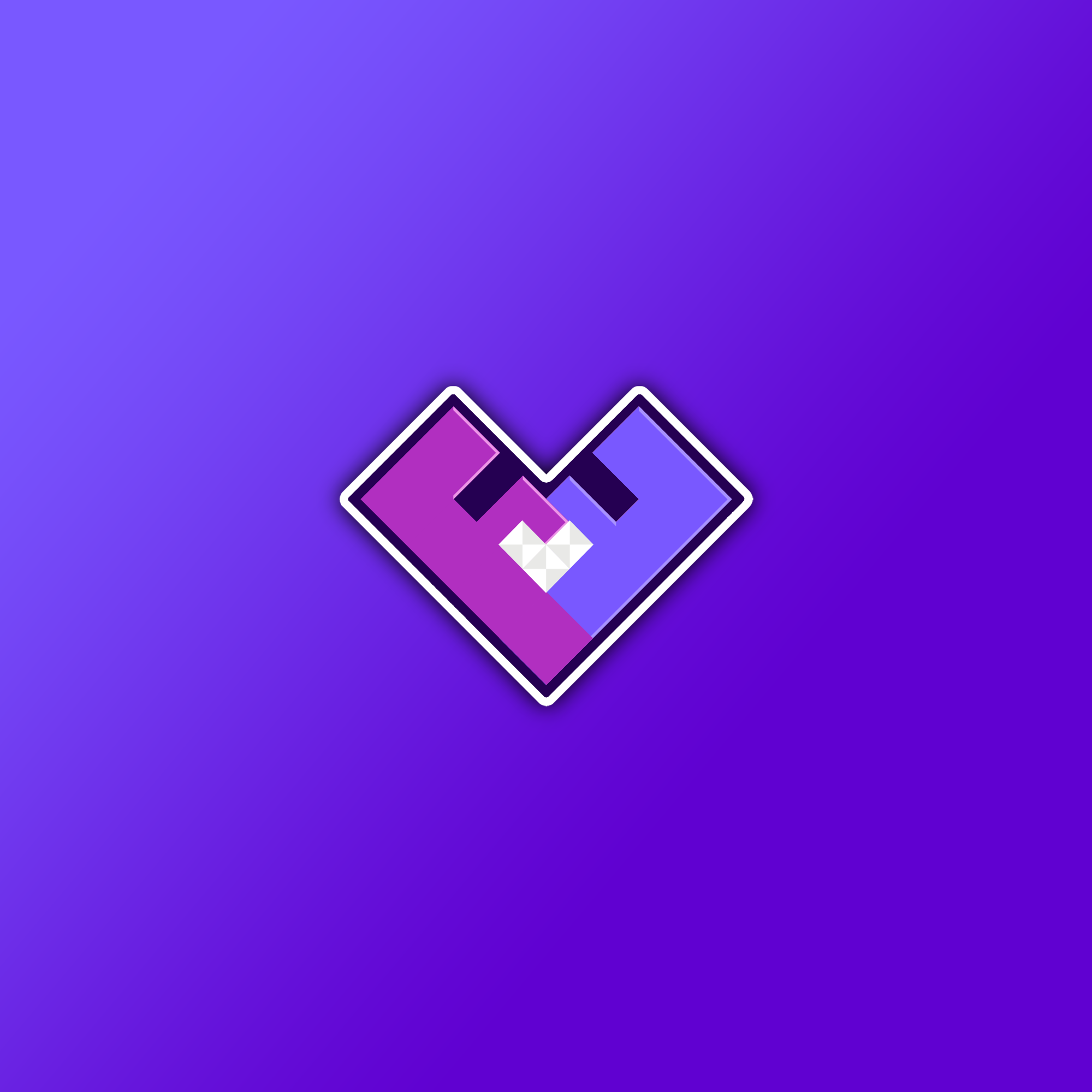
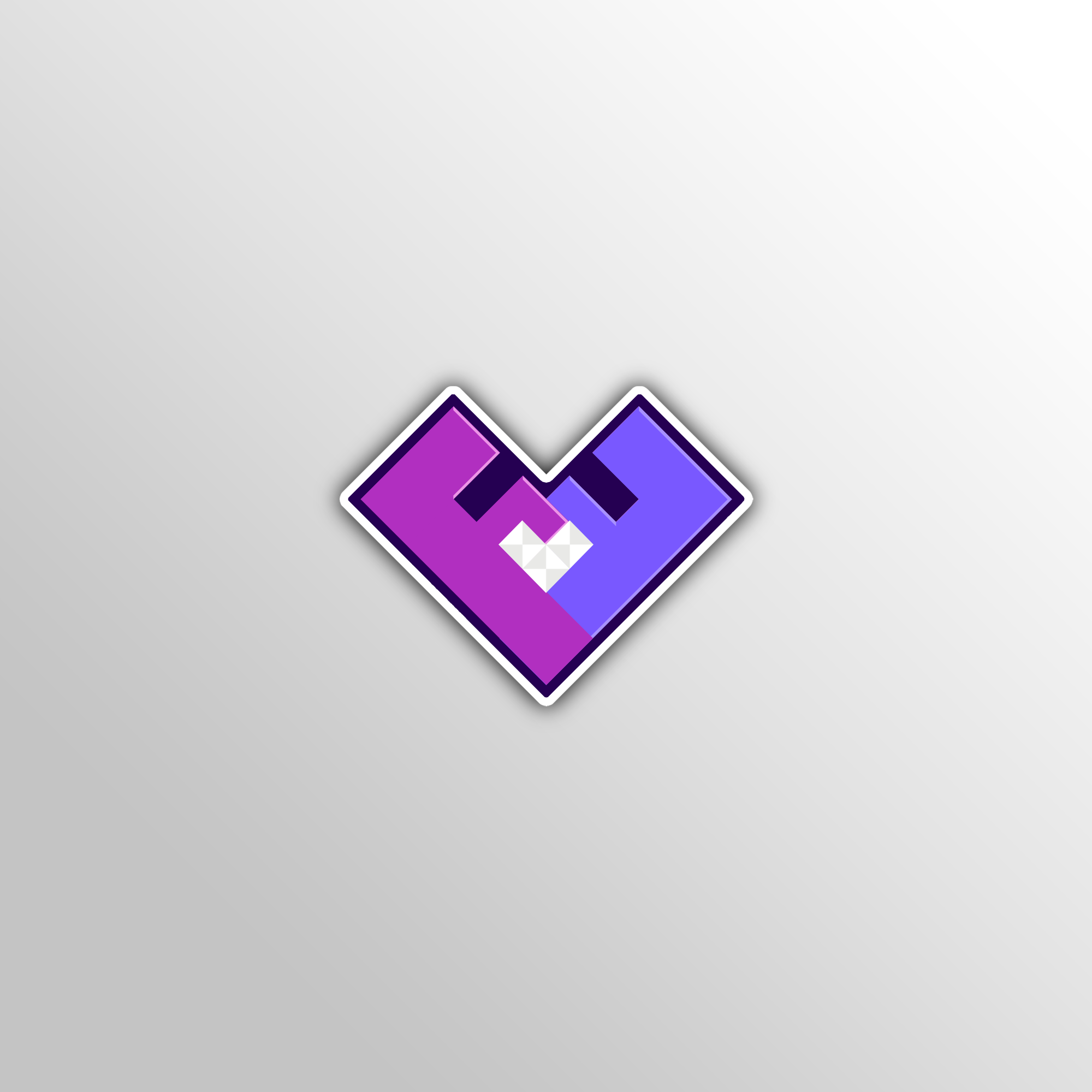
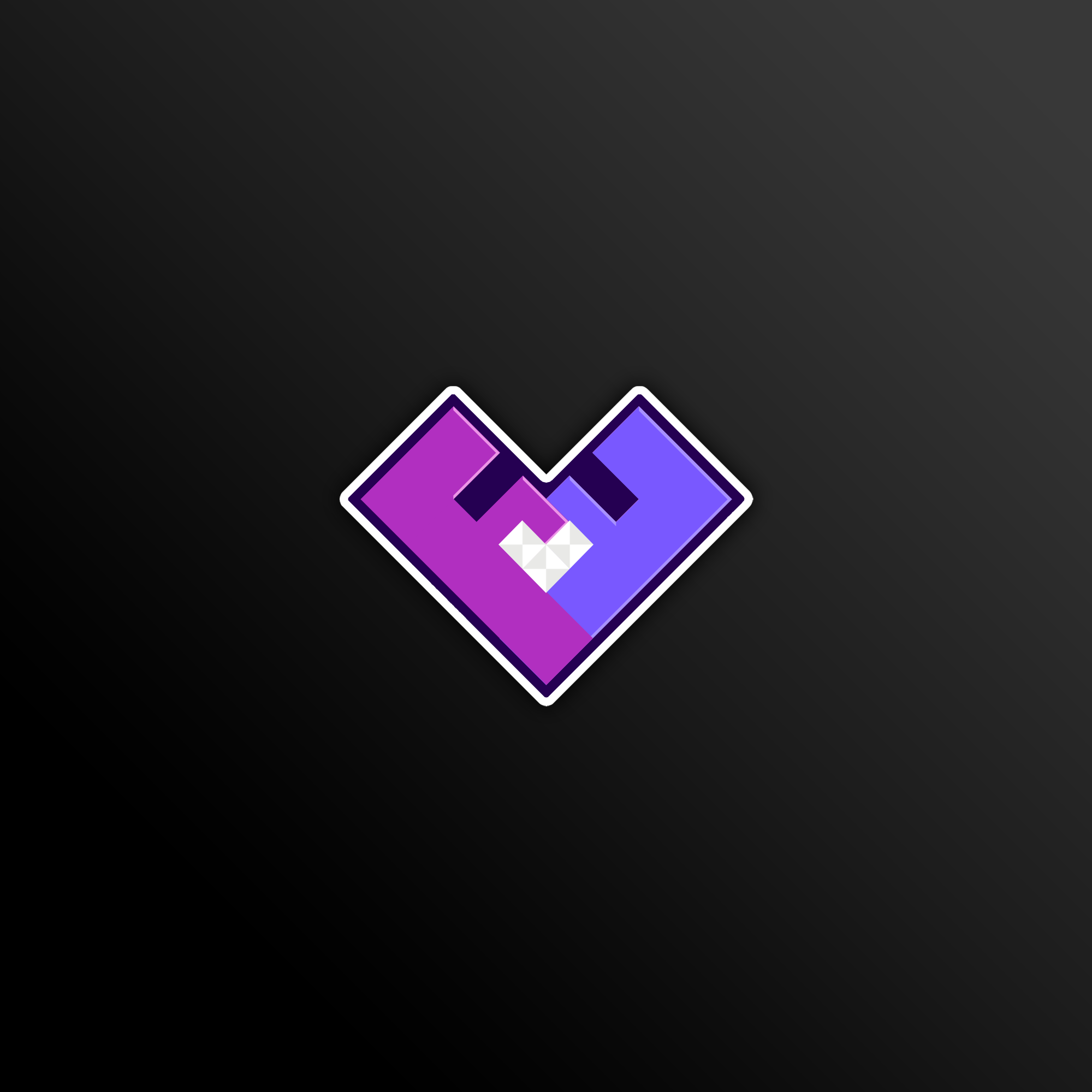
The team drafted a basic heart shape appropriate for a dating app. The absence of curves and rounded edges creates a more dynamic look.
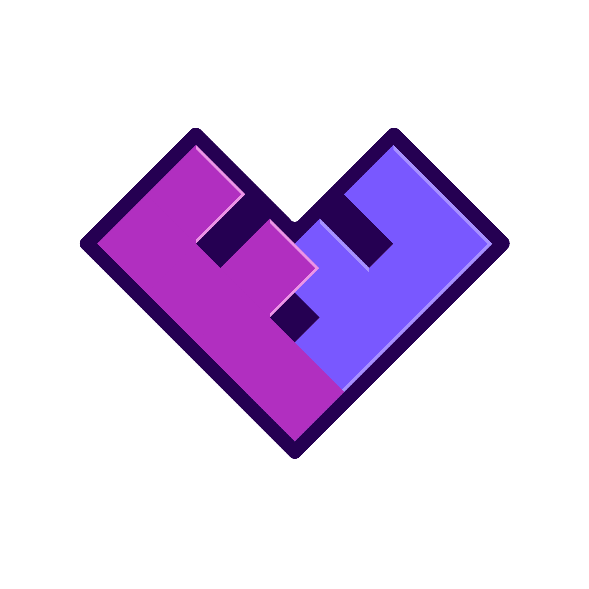
Two block letter F’s were mirrored to form a heart shape, creating an appealing visual combination of both shapes and letters to represent the app’s initials.
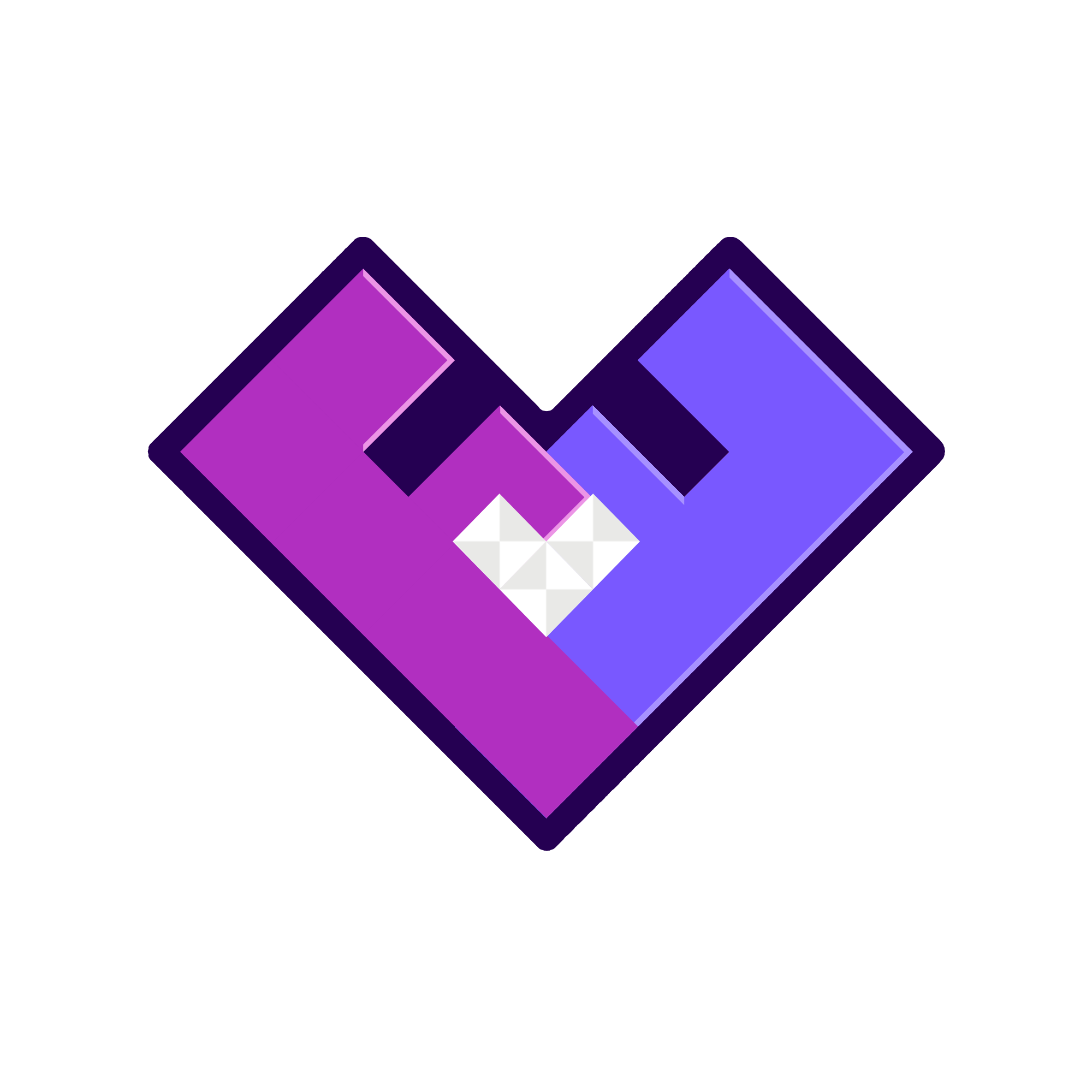
A diamond heart is embedded in the center of the logo bring out the overall sharpness, the grey balancing out the bold shades of purple.
Initial Logo Concept
The initial logo colors were conceptualized in shades of magenta. In the end, the team opted to add blues that were complimentary to the present purples, giving a greater contrast to the embedded diamond heart.
Color Palette
Following Firefly’s vision, the team settled on colors that brought out the neon vibe, while still keeping a playful tone.
#B12FC0
#7958FF
#250052
#FFFFFF
#E9E9E7